Account Activity Milestones
Project Overview
Pain Points:
Lack of transparency into what triggers buying and selling activity on individual accounts.
Financial Advisors and branch employees were unable to give transparent insight to their clients with confidence.
The current system was a manual process that spanned multiple tools and required manual input. It was highly inaccurate and resulted in hours of preparation, prior to all meetings.
Context Notes:
This particular pain point had existed for over 10 years when it was brought to me. The workflow of account reviews is a universal workflow for all financial advisors and their branch support staff. Four previous attempts to come to a solution were made; always driven from the corporate office and lacked user level research and input.
I was engaged by the product manager to approach the problem with a strategic UX lens. The plan was to take my recommended strategy on a road show to all stakeholders to gain momentum and get the project funded.
Key Findings Summary:
Financial Advisors and their branches needed “at a glance” information to effectively work through the number of accounts managed.
They wanted both high level information and the details. Just not at the same time.
They viewed the information this would provide as a way to show the value of their services, specifically at the client’s annual review.
Above all, they wanted to feel confident in the events and data they shared with their clients. They viewed it as a way to show credibility.
Deliverables:
Milestones Dashboard tool (concept to general release); features included:
Interactive graph with filters to narrow information and easily switch between the most impactful pieces of data
Visual representation of trade activity in an account, organized by event types
Ability to see high level activity “at a glance” with the option to drill down into the details
Roadmap for iterative releases to expand and refine the tool’s capabilities; prioritized by highest user need
Snapshot for Results:
Project was fully funded and released to a high satisfaction rate.
88.8% Adoption rate after 3 months
Average time in tool: 2 minutes and 42 seconds (Industry baseline is 54 seconds)
100% repeat visit rate from adoption group
In Depth Process Information
Discovery Research
-
Initial Assumptions:
The following are the assumptions that were turned over to me, prior to discovery and required validation.
This pain point, while a problem, did not significantly impact the branch work.
Branches created their own usable workarounds to navigate the process.
The information provided to clients was accurate, but incomplete.
Current tools (while not ideal) provided branches with a reasonable amount of information for the client.
Process:
To validate the initial assumptions, I conducted the following discovery research:
1 on 1 business stakeholder interviews
Workflow and journey mapping of available tools
Collecting and sorting through the available training materials for the branch employees, regarding the process.
-
I used the above methods to validate the initial assumptions and was able to refine my assumptions into the below validated findings:
Previous Assumption: This pain point, while a problem, did not significantly impact the branch work.
Updated finding: The pain point significantly impacted branch work, resulting in a loss of hours in productivity and often, inaccurate information.
Previous Assumption: Branches created their own usable workarounds to navigate the process.
Assumption validated.
Previous Assumption: The information provided to clients was accurate, but incomplete.
Updated Finding: It was actually impossible for branches to know if the information they were providing to clients was inaccurate or complete.
Previous Assumption: Current tools (while not ideal) provided branches with a reasonable amount of information for the client.
Updated Finding: Current tools provided a small amount of information. However, to piece together the information from each tool required manual cross checking of the information across 3-7 tools, depending on the event and asset class.
The primary complaint was not the lack of information, but the inability to get any information efficiently or with confidence.
Branches wanted something that distilled the information concisely and in a format that allowed them to map to a time frame.
Problem Statement
With the above validated findings, I settled on the below problem statement:
“How can we provide accurate, easily understood, and timely information to the branches that will help them best serve their clients with confidence?”
Initial Concepts
I have the habit of working out my initial ideas on paper. Here is a messy look into my brain during this process:


MVP Solution

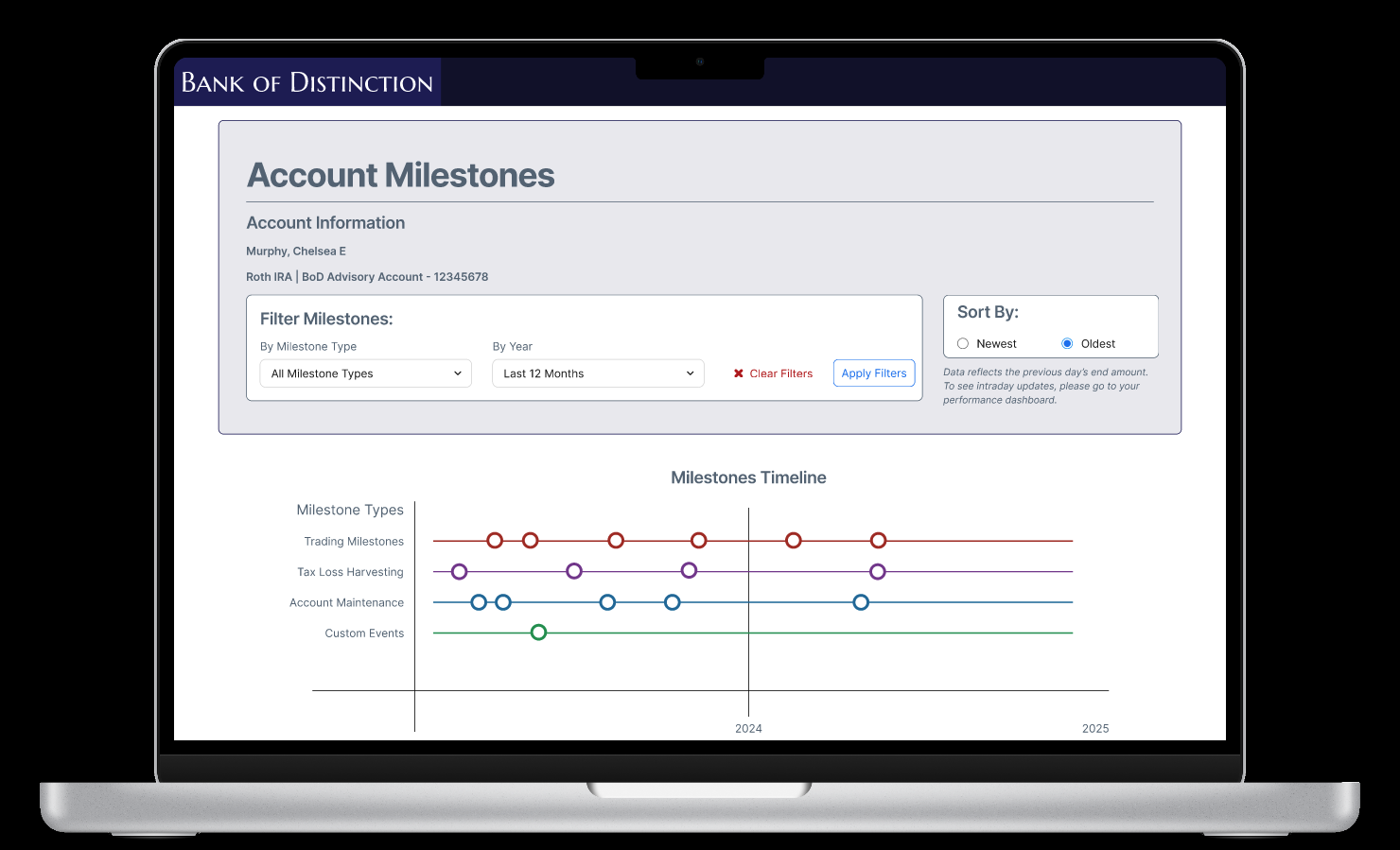
The final product was an interactive timeline that the Financial Advisors could start by skimming to get a quick glance of the types and frequency of milestones; then drill down into specific event types.
Note: the above is an anonymized version of the final product and is for illustrative purposes only.
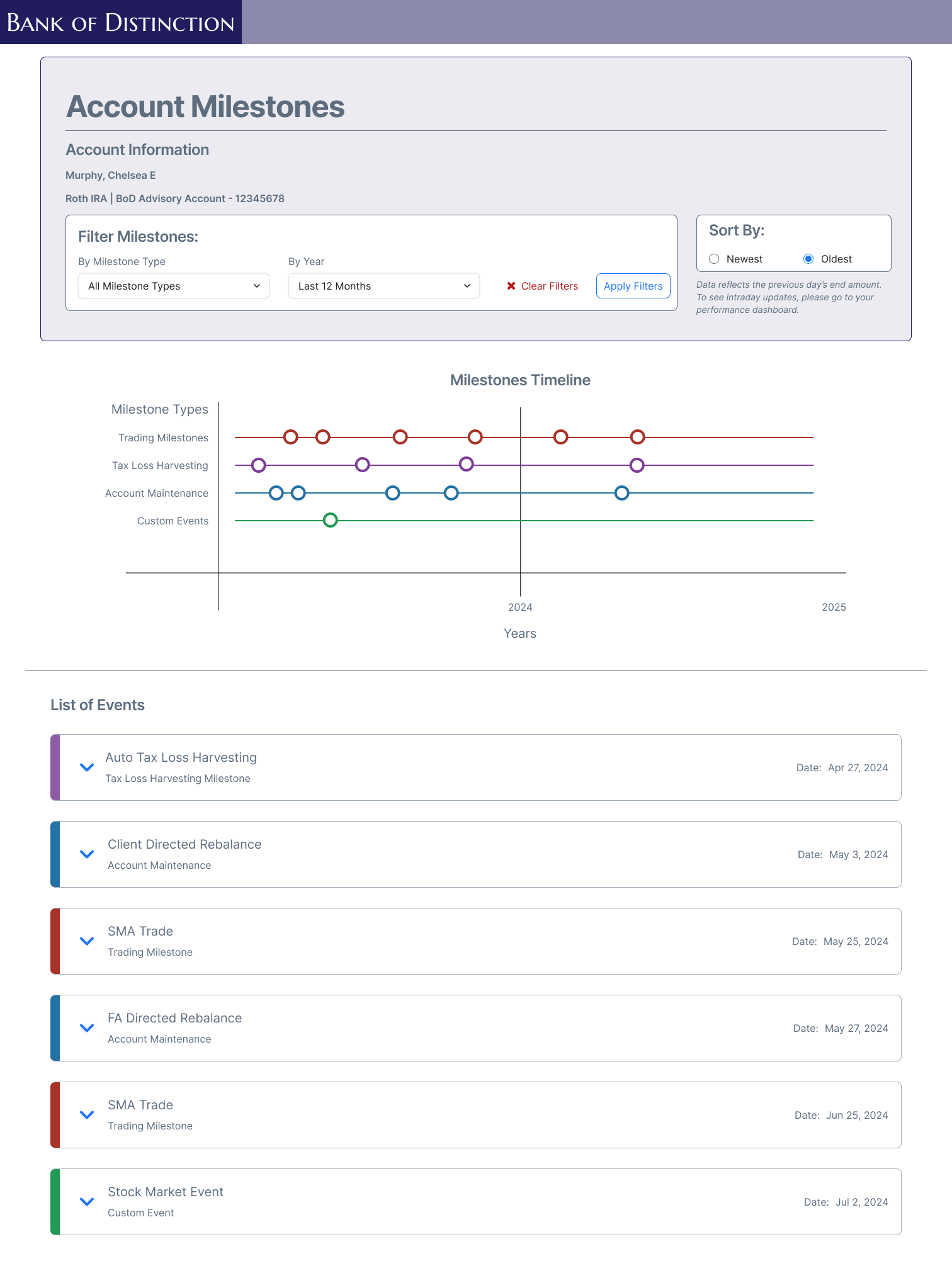
Default View | Full Screen
Above the fold focused on the “snapshot” with the ability to scroll to see the full list.
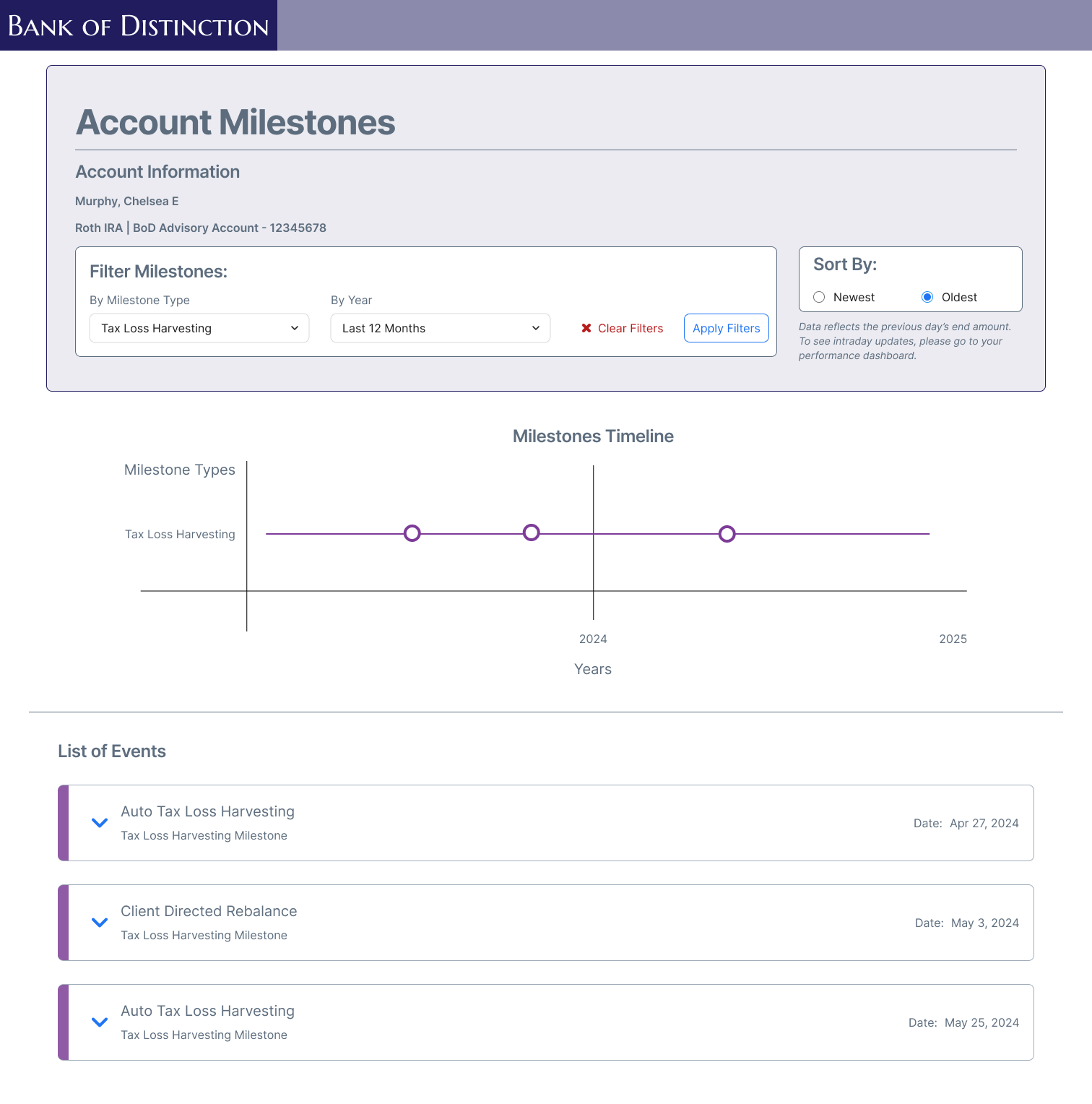
Filtered View | Single Event Type
Filters allow the user to narrow amount of events to just see 1 milestone type. Sorting allowed for the user to change what appears at the top.
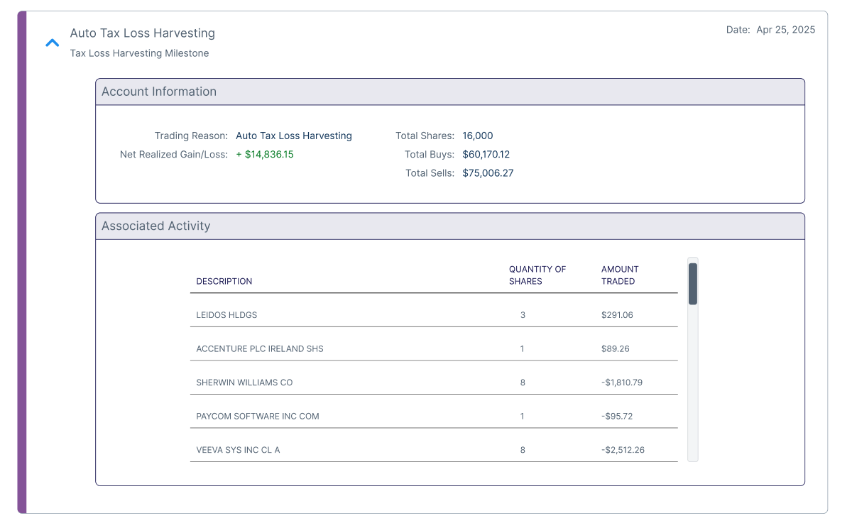
Expanded Detail | Account Information and Activity
Individual cards provide deep level information identified through rigorous discovery and usability research.